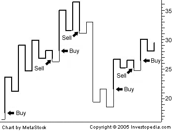
Kagi chart — The Kagi chart is used for tracking price movements and to make decisions on purchasing stock. It differs from traditional stock charts, such as the Candlestick chart by being mostly independent of time. This feature aids in producing a chart… … Wikipedia
Kagi — may refer to: * Kagi (island) * Kagi (company) a company that handles transactions and order fulfillment for online merchants * John Henry Kagi * kagi (weapon) * Kagi chart * The Japanese name for Chiayi, Taiwan … Wikipedia
Chart — For other uses, see Chart (disambiguation) , Graph (disambiguation) , and Diagram For information about charts in Wikipedia, see Wikipedia:Graphs and charts. A pie chart. A chart is a graphical representation of data, in which the … Wikipedia
Chart pattern — A chart pattern is a pattern that is formed within a chart when prices are graphed. In stock and commodity markets trading, chart pattern studies play a large role during technical analysis. When data is plotted there is usually a pattern which… … Wikipedia
Open-high-low-close chart — An OHLC chart, with a moving average and Bollinger bands superimposed. An open high low close chart (also OHLC chart, or simply bar chart) is a type of chart typically used to illustrate movements in the price of a financial instrument over time … Wikipedia
Point and figure chart — A point and figure chart is used for technical analysis of securities. Unlike most other investment charts, point and figure charts do not present a linear representation of time. Instead, they show trends in price.The aim of point and figure… … Wikipedia
Technical analysis — Financial markets Public market Exchange Securities Bond market Fixed income Corporate bond Government bond Municipal bond … Wikipedia
Moving average — For other uses, see Moving average (disambiguation). In statistics, a moving average, also called rolling average, rolling mean or running average, is a type of finite impulse response filter used to analyze a set of data points by creating a… … Wikipedia
Market trend — Statues of the two symbolic beasts of finance, the bear and the bull, in front of the Frankfurt Stock Exchange. A market trend is a putative tendency of a financial market to move in a particular direction over time.[1] These trends are… … Wikipedia
Relative Strength Index — The Relative Strength Index (RSI) is a technical indicator used in the technical analysis of financial markets. It is intended to chart the current and historical strength or weakness of a stock or market based on the closing prices of a recent… … Wikipedia